
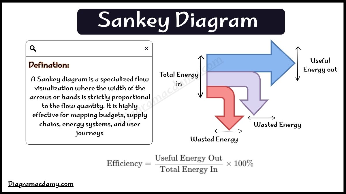
A Sankey diagram is a type of flow diagram that shows the movement, transfer, and distribution of quantities between different systems or categories. The main feature of a Sankey diagram is that the width of each flow arrow is proportional to the amount of energy, material, money, or resources being transferred. This makes it easier to understand where inputs come from, how they are distributed, and where losses occur. Sankey diagrams are commonly used in energy flow, physics, engineering, environmental studies, business analysis, and data visualization.
In physics, a Sankey diagram is often used to represent energy transfers. For example, it can show how energy supplied to a machine is converted into useful energy and wasted energy. The input energy is represented by a wide arrow, while smaller arrows show useful output and energy lost as heat or sound. In IGCSE Physics, Sankey diagrams help students understand energy efficiency and energy conservation by visually showing how energy changes from one form to another.
How Does a Sankey Diagram Work?
A Sankey diagram uses connected arrows or bands to represent flows between different points. The size or thickness of each arrow represents the quantity of flow. A larger flow is shown with a wider arrow, while a smaller flow appears as a thinner line.
For example, in an energy Sankey diagram:
- The starting arrow represents the total input energy.
- The useful energy output is shown with a main flow.
- Wasted energy is shown with smaller branches.
- The total input energy always equals the total output energy because energy cannot be created or destroyed.
This makes Sankey diagrams useful for explaining complex systems in a simple visual format.
How to Make a Sankey Diagram?
Creating a Sankey diagram involves a few simple steps:
1. Identify the Flow Data
First, collect the information you want to display, such as energy input, useful output, and energy loss.
2. Define the Sources and Destinations
Decide where the flow begins and where it ends. These points are called nodes.
3. Assign Values to Each Flow
Each connection should have a numerical value that determines the width of the flow line.
4. Draw the Sankey Diagram
Use diagram software, Excel tools, or programming libraries to create the visual representation.
Popular tools for making Sankey diagrams include:
- Excel Sankey diagram templates
- Plotly Sankey diagram
- Online Sankey diagram makers
- Data visualization software
How to Draw a Sankey Diagram?
To draw a Sankey diagram manually:
- Write the total input value on the left side.
- Draw a thick arrow representing the input.
- Split the arrow into useful energy and wasted energy.
- Make each arrow width proportional to its value.
- Label every flow clearly.
For example:
Electrical Energy Input → Light Energy Output + Heat Energy Loss
The light energy arrow will be smaller than the total input because some energy is lost as heat.
Sankey Diagram in Excel
An Excel Sankey diagram can be created by using templates, charts, or additional tools. Although Excel does not have a built-in Sankey chart option, users can create one by organizing flow data and using visualization methods.
Steps include:
- Prepare source, destination, and value columns.
- Add the data to a Sankey diagram template.
- Adjust flow widths according to values.
- Add labels and formatting for better understanding.
Plotly Sankey Diagram
A Plotly Sankey diagram is a popular method for creating interactive Sankey diagrams using Python. Plotly allows users to create diagrams where users can hover over flows and view detailed information.
Plotly Sankey diagrams are commonly used for:
- Energy analysis
- Financial flow visualization
- Website traffic analysis
- Resource management
Alluvial Sankey Diagram
An alluvial Sankey diagram is a similar type of flow visualization used to show changes and movements between groups over time. It is commonly used in:
- Population studies
- Customer journey analysis
- Healthcare data
- Social science research
While Sankey diagrams usually focus on quantities and energy flows, alluvial diagrams often highlight transitions between categories.
Sankey Diagram in Physics and Energy
In physics, a Sankey diagram is mainly used to show energy transfers and efficiency. It helps explain that energy is transformed from one form to another, but some energy is always wasted.
For example:
100 J Electrical Energy → 80 J Useful Light Energy + 20 J Heat Energy
The diagram visually represents that the useful output is smaller than the input because of energy losses.